UX Case Study:
Happy Saplings Health Management
Case Study Overview


The Product
Happy Saplings is a streamlined health management app that enables parents to review their children’s health records, print records to meet school or camp requirements, and see when their children’s healthcare visits are due.
The initial parameters and design goals of this family health management app were prompted by a UX Design course offered through the Google Career Certificate program.
Project Duration
December 2024-May 2025
Product Outcome:
This case study resulted in a low-fidelity prototype created in Figma, seen in action below.
The Problem
Parents of children and teens have limited time, energy, and financial resources to devote to managing their children’s health records. This can make it challenging to appropriately meet their children’s school or camp requirements effectively.
The Goal
Happy Saplings is an app for family health management. It will let users coordinate health visits, collect records or documentation, meet school/camp requirements, and provide streamlined avenues to make submissions to or contact with relevant organizations.
In this way, the product will make different steps of coordinating care and fulfilling school/camp requirements more accessible and less stressful for parents on the go.
We will measure effectiveness by analyzing:
the number of health records viewed,
the number of health records printed, and
the number of records submitted to schools/camps.
Role & Responsibilities
UX Researcher/Designer
My role within the UX Case Study for Happy Saplings: A Health Management App is that of a researcher, designer, and student. As a learning experience rooted in real-world needs and working with hypothetical interview information, this project is a practical application of design theory and fundamentals.
My responsibilities included everything needed to move the project from the initial phases of empathizing with users and conducting user research through to early design work and prototyping. Additional work is ongoing regarding usability tests and high-fidelity prototypes.
Case Study Snapshot:
Understanding the User
User research is a key aspect of how designers create empathy for their audience and a product that addresses their needs and wants.
Information from Users
The user research for this project involved short interviews with users (provided by Google’s course) and collecting biographical information from a varied population with diverse backgrounds.
Assumptions
Prior to conducting research, the design team’s assumptions about user needs focused on the stress and confusion surrounding medical records and health visits. The team wanted to lessen stress for parents on the go while giving them the tools to stay organized. Because of this, helping parents track health/medical information and stay on top of different organizations’ requirements and deadlines was an immediate priority.
These general assumptions did hold true based on the interviews—however, there was also interest around saving time and money in all aspects of childcare. Based on this finding, it was important to think about how parents want to manage their resources at home while moving forward with designing the product.
Initial Takeaways
Here are the early takeaways following the user research stage and analyzing interviews with parents who would need to submit health records for their kids’ schools/camps:
Parents have limited time, energy, and financial resources, which puts a strain on their personal and family lives.
The amount of unorganized information, requirements, and processes involved with child healthcare and school/camp requirements can be overwhelming to manage.
Tracking timelines, due dates, and healthcare visits is a resource-intensive process.
User Research: Pain Points
The design goals should be centered around addressing user pain points in order to achieve a unique product that serves the user. Throughout this phase of the design process, four key pain points were outlined as priorities:
Pain Point: User overwhelm and stress
Summary: It is easy for people to feel overwhelmed by the demands on their time and are looking for ways to manage that stress.
Design goal: Clearly lay out needs and priorities to help users understand what needs to happen when.
Pain Point: User frustration and time considerations
Summary: Some users are frustrated by hard-to-use tools or tasks that take longer than they’d like, considering everything else they have going on.
Design goal: Make an easy-to-use system that is simple to access and navigate to minimize the time they have to spend checking items off their to-do lists.
Pain Point: User confusion and obstacles to their success
Summary: Some users are confused by red tape, office communication, or the availability of important information in different environments, which can cause stress and anxiety.
Design goal: Allow users to personalize how they access healthcare information to match their needs/preferences and have the app provide friendly guidance when needed.
Pain Point: User limitations and management of resources
Summary: A shared pain point for many users is the challenge of managing time, health, and money in their lives.
Design goal: Give users options for how to manage time commitments and effective costs when dealing with medical records and health visits.
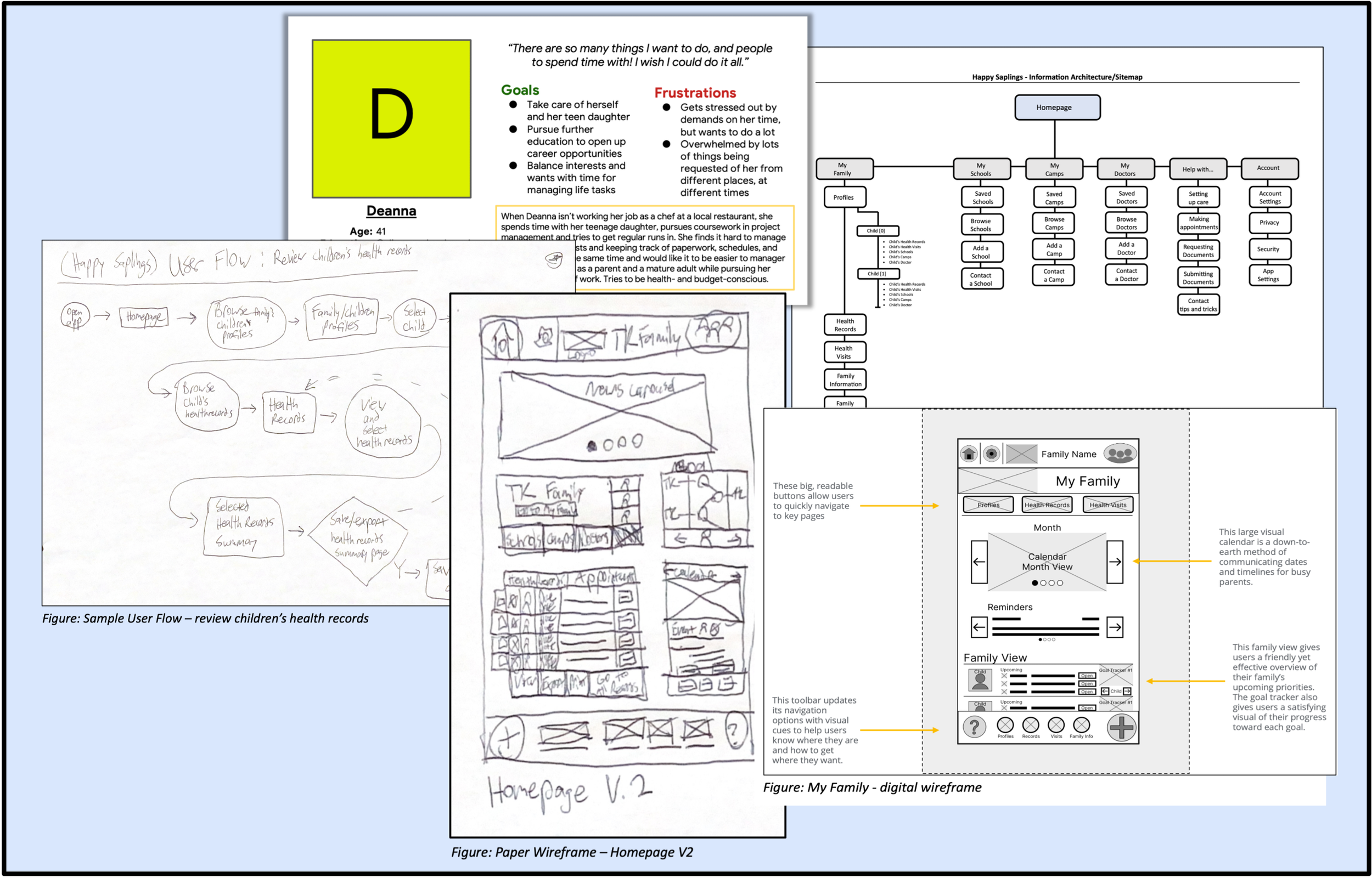
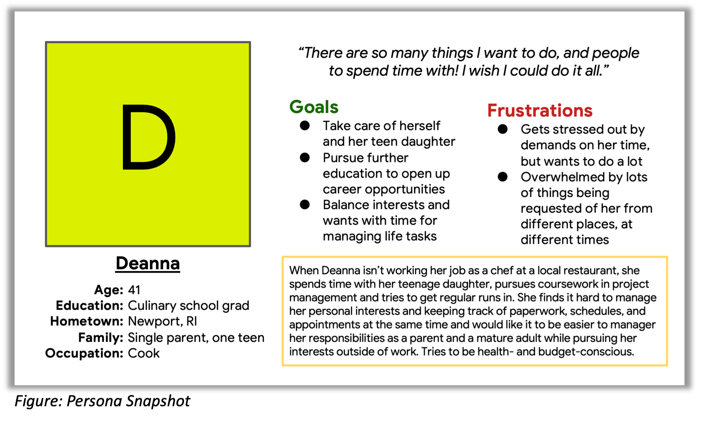
Persona
The persona guides design considerations as it helps the team focus on specific and representative use cases. The problem statement and persona below were drafted and finalized based on the previously discussed user research.
Problem Statement:
Deanna is an active, working single mother who needs a quick and intuitive way to manage her child’s health records and doctor visits to help meet school/camp requirements. This is important to her because it’s confusing and stressful to handle so many administrative tasks from these organizations in the midst of her already busy schedule and day-to-day activities.
Persona (Deanna):
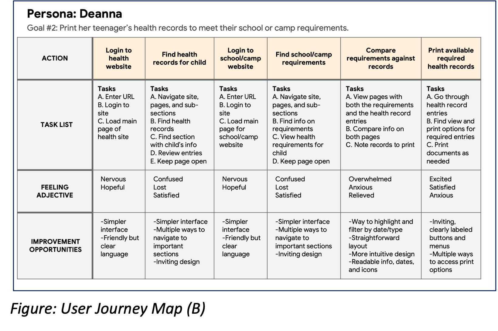
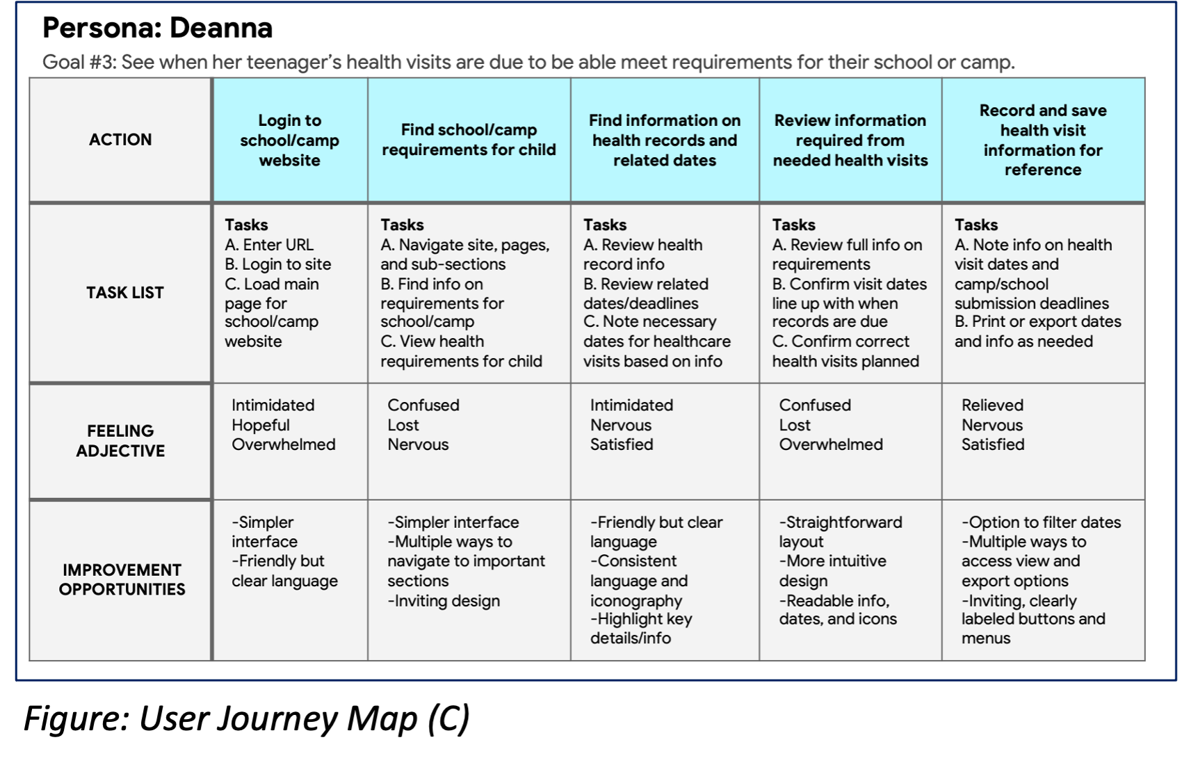
User Journey Maps
Deanna’s user journey is all about accessing, compiling, and submitting information involving her teenager’s health records so that she can meet school/camp requirements.
While each step of the various goals she has to accomplish is easy to outline, there are a large number of decision points and obstacles to success along the way. Because of how complicated administrative tasks and thought processes around health record management can get, users like Deanna can feel everything from hope and excitement to confusion and anxiety.
The biggest pain points for the Deanna persona in these user journeys include having to make too many decisions, not having clear ways to succeed, and feeling stressed about potentially failing at something that matters to her family.

Goals & Considerations
With the initial phases of user research complete, I proceeded to elaborate on the goals, considerations, and parameters that will define the design of the Happy Saplings health management app.
In particular, I focused on a variety of hypothesis statements to further the problem statement tied to Deanna’s persona—and continued to develop unique value propositions that will set this product apart.
Hypothesis Statements
Hypothesis Statement #1:
If Deanna downloads an app that collects and displays health requirements in a quick and easy way, then she can make sure her daughter’s health records are ready for upcoming school/camp activities.
Hypothesis Statement #2:
Deanna needs an app that can organize, filter, and display both health requirements and associated dates for health visits so that her daughter has the health records that allow her to participate in school/camp activities.
Hypothesis Statement #3:
If Deanna can schedule or input health visit dates easily on a mobile app and compare that information against health requirements for her daughter’s schools/camps, then she can ensure her daughter is set up for success while balancing her own job, interests, and hobbies.
Value Propositions
The following are this product’s unique value propositions that address users’ needs:
Family and child profiles that are easy to update and access
Friendly, conversational prompts and reminders with accessibility options
Centralized place to save and access all health information
Shortcuts, links, and saved information to various organizations
One-click options to print, access, and export health information for each child
Auto-fill options for schools/camps and health organizations
Customizable and auto-updating calendar
Auto-generated templates or scripts for communication
Integrated email support
Easy-to-read iconography and text
Customizable icons, buttons, and visual language
Starting the Design
Moving forward with ideation and design brings us to brainstorming exercises, information architecture, wireframing, and prototyping. This stage includes aspects of standard design practice, including the following:
Sitemap and User Flow
Paper Wireframes
Digital Wireframes
Low-Fidelity Prototype
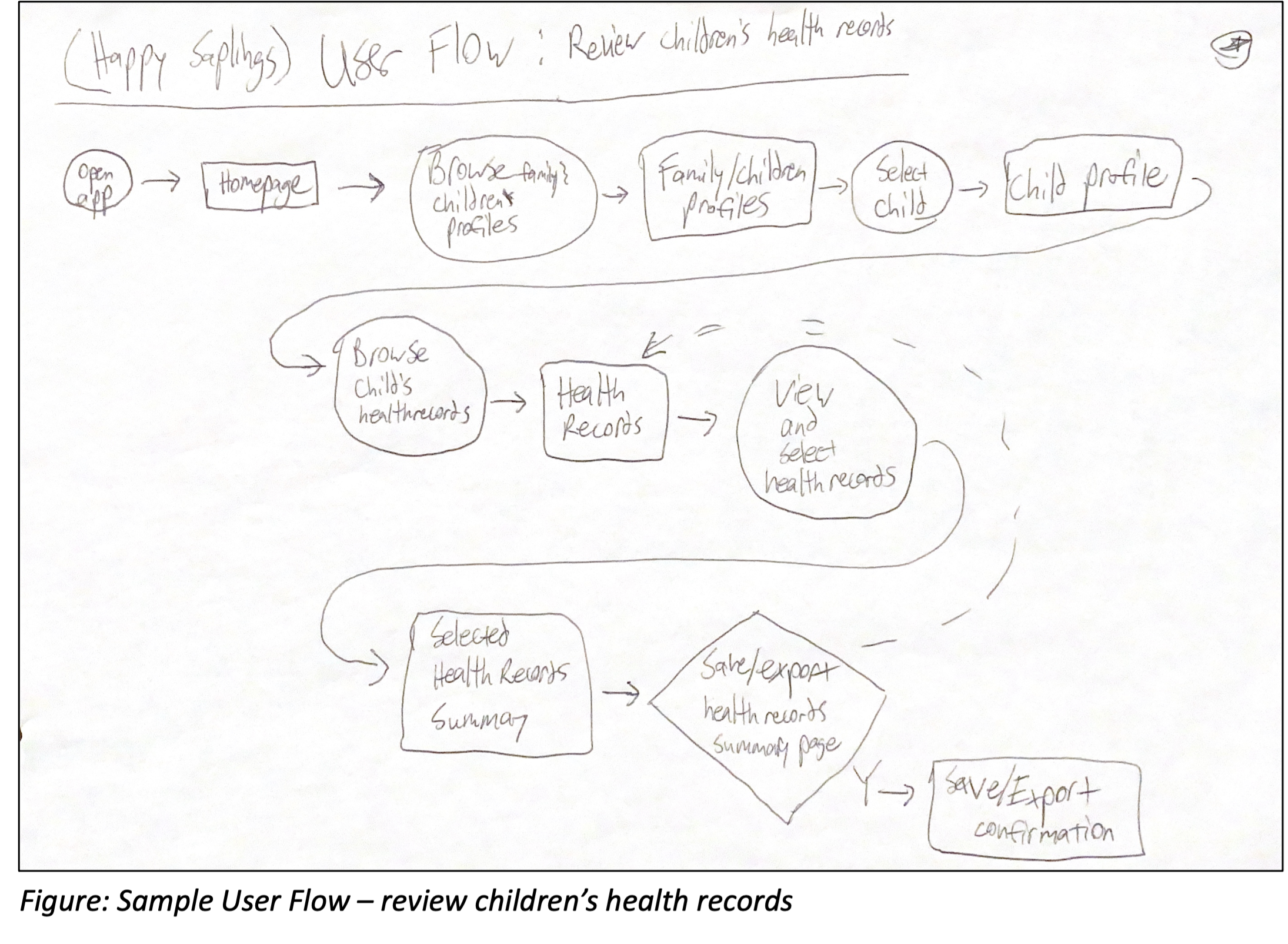
Sitemap & User Flow
Starting the design began with ideation, storyboarding, and the creation of user flows. This all led to the first iterations of information architecture for the Happy Saplings app. I further refined the product’s logic and flow while working on both the Happy Sapling app’s sitemap and wireframe models of key screens and pages.
The sitemap at this stage of the design process informed the wireframes and vice versa, ultimately leading to the version included below.

An example user flow that helped guide the construction of this sitemap seen here:
Paper Wireframes
The homepage is the starting point within the app. Users need a welcoming and encouraging place to dive into family health management throughout their busy days.
By implementing paper wireframes at first, I could highlight and iterate upon key features (starred in the image).
I created the first version of the homepage screen using key aspects from the five draft sketches seen below.


To create the second version of the homepage screen, I reviewed all of the wireframes created across the app during the initial ideation (14 total screens).
I created two additional iterations before settling on a second version of the homepage. This version combined key elements developed through the ideation process that highlighted:
important information,
ease of use, and
intuitive navigation.


This same process led to the final paper wireframe for the My Family page of the app.
As a preview of the next section on digital wireframes, the iterations of the My Family page are shown below.
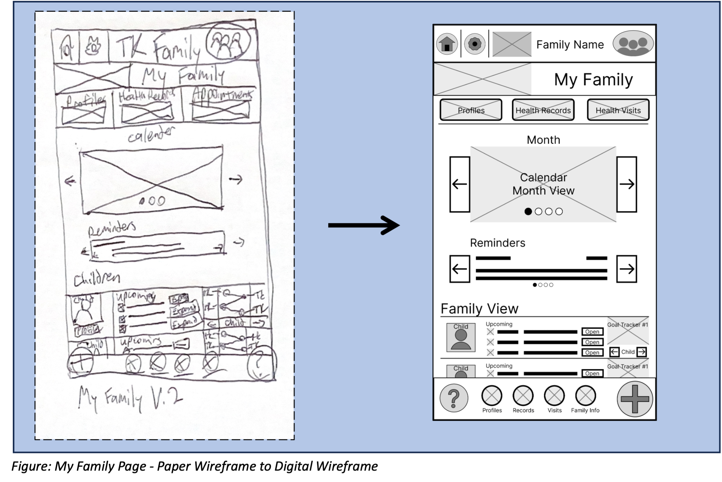
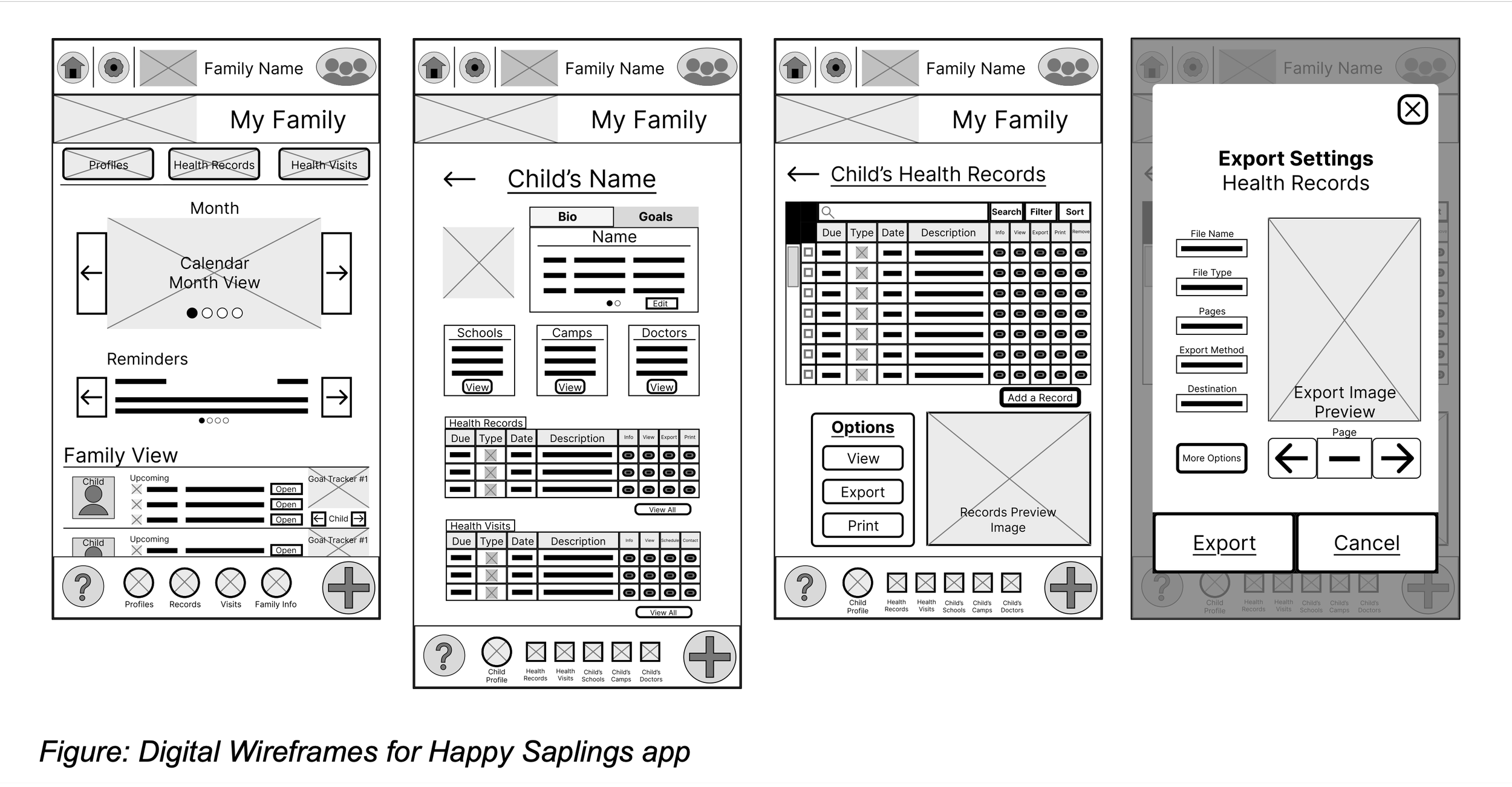
Digital Wireframes
As I moved through the design process, the digital wireframes incorporated key elements and priorities taken from feedback and findings from the user research.
Wireframe #1:
Users wanted an effective way to navigate a complicated system without being overwhelmed. So, a clean, welcoming, and intuitive design was a priority alongside avenues to communicate important data and information.

Wireframe #2:
Headers, toolbars, and buttons were all important elements to use as a way to make navigation simple to do without getting lost.
Providing white space, visuals, and clearly separated sections was another key consideration for minimizing stress while helping parents be productive on the go.

Wireframe #3:
Since each family is unique, the app needed to allow space for the personalization, customization, detail, and focus users may want to apply to their family as a whole as well as for each individual child.
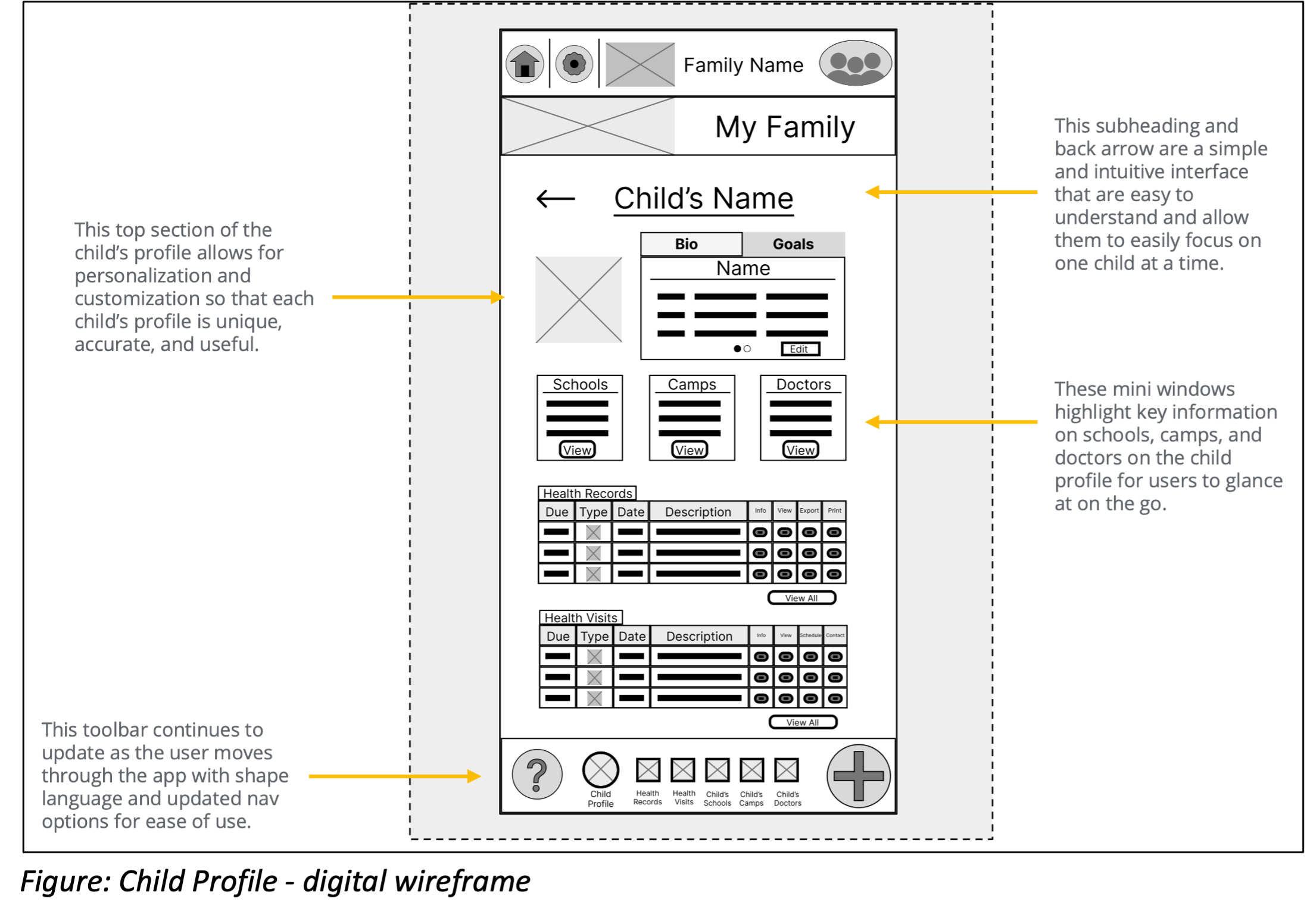
Wireframe #4:
Because the user’s information and documents are so important and personal to them, each user needs to feel like they are set up for success to accomplish their tasks with ease and confidence.

Wireframe #5:
As parents start finalizing documents and interacting more directly with the school/camp/health systems, it is important to keep the experience as simple and easy to use as possible. The challenge is to keep it simple while making sure users still have all the tools need to accomplish their goals.

Wireframe #6:
Users will appreciate a sense of accomplishment as they complete tasks. They will also look for guidance on how to proceed as they move through each step of the records process.

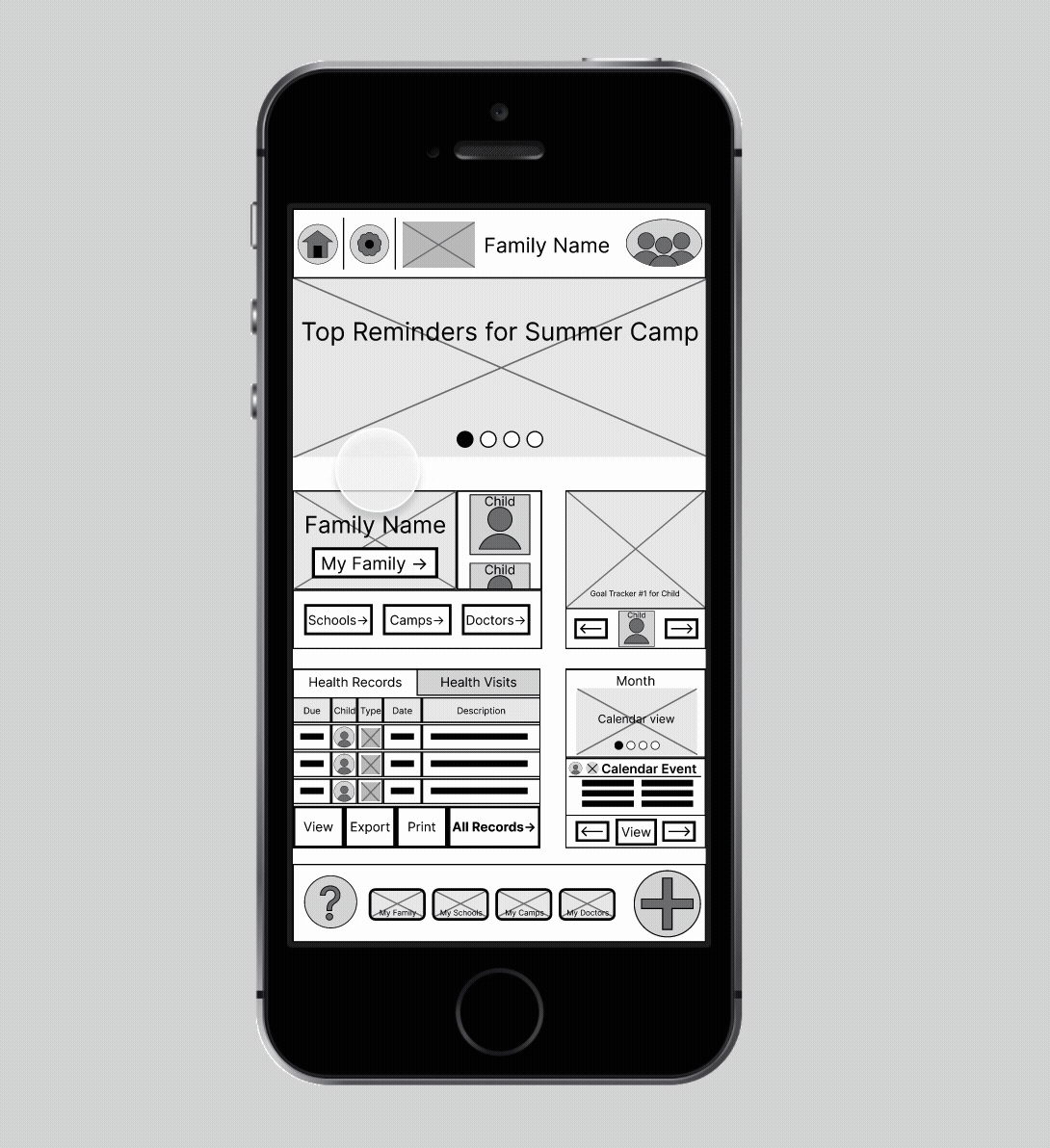
Low-Fidelity Prototypes
Lo-Fi Prototype
The prototype overview below highlights all of the actions a user takes when they want to view and export their child’s health records.

The close-up screenshots below further illustrate the user journey, starting at the Home Screen. This prototype enables users to click through to the My Family page and onto a child’s Profile so that they can view and export a selection of health records through the child’s Health Records page.
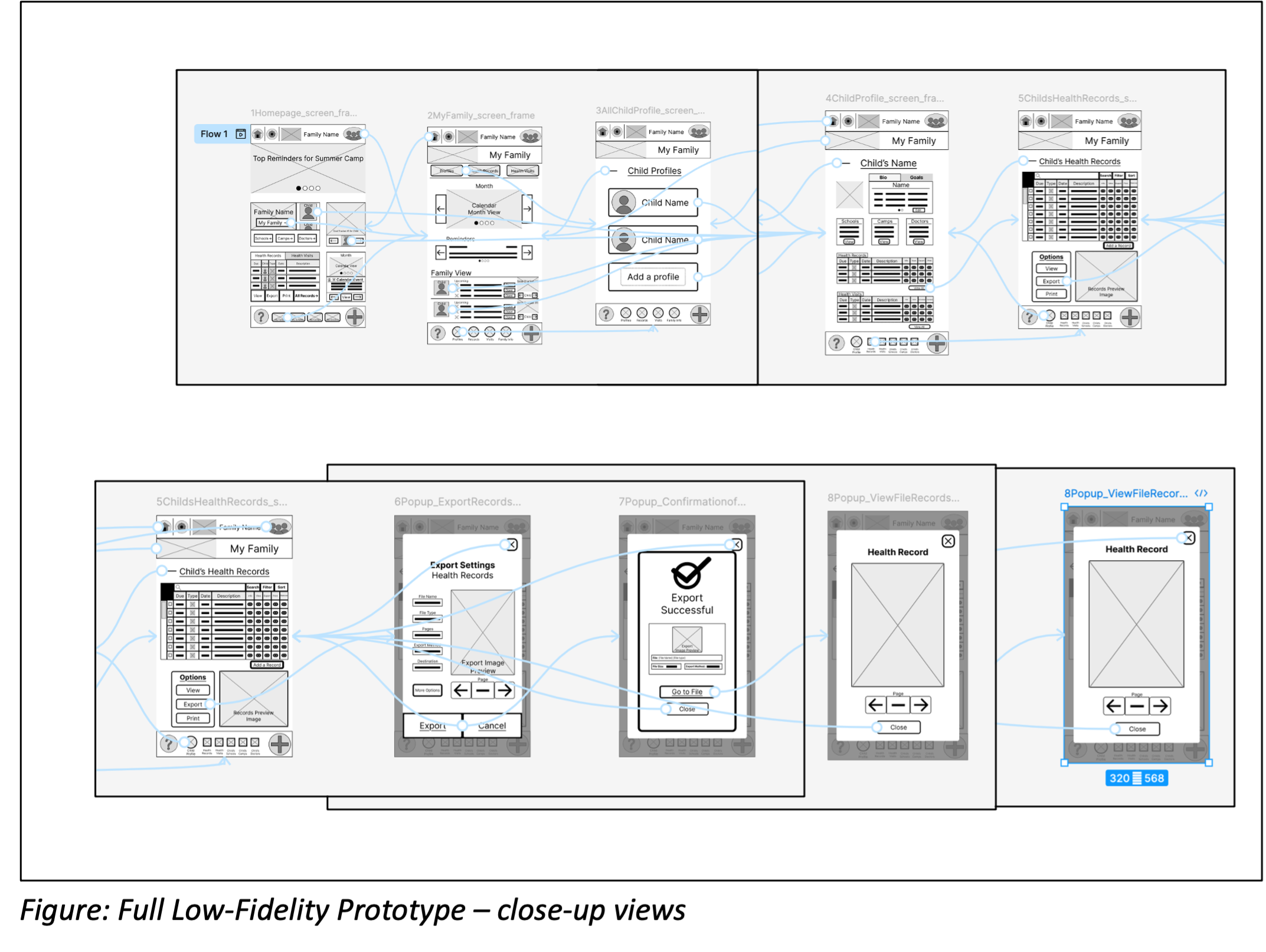
Lo-Fi Prototype in Action
The lo-fi prototype demonstrates full navigation functionality through the user journey, with several methods to:
move forward and backward,
interact with key decision points (i.e., viewing the final file output or not), and
return to the home screen.

Figure: Full Low-Fidelity Prototype – user flow in action
Next Steps
With the low-fidelity prototype in place, testing and iteration are the next tasks to complete. Testing incorporates more user research at this point in the process to help us refine initial designs. This is done with usability studies which help ensure a design team is well on its way to developing a polished and finished product.
Usability Studies
To truly be able to iterate, design requires user testing. Usability tests will reach an online user base that can help test and evaluate the current prototypes. Gathering data on these user interactions and feedback gives me the tools to polish and innovate as I continue to work on the design.
Refining the Design
Further design work will take the Happy Saplings app closer to a polished final product. It will involve the following key aspects of design iteration:
Mock-ups
High-Fidelity Prototype
Accessibility Considerations
Takeaways
As a course-based project and case study, the Happy Saplings family healthcare management app has continued to interest and challenge me as a creative professional exploring the foundations and guiding principles of UX design.
From operating within an established framework to applying principles within a realistic scenario, I have been able to focus on the early stages of designing a successful product. I could then leverage those learnings in Figma to develop early wireframes and prototypes. The early phases around understanding the user and their pain points and needs made all the difference when moving into drafting design solutions.
Beyond the existing work in this case study, I look forward to the ongoing progress around usability testing and high-fidelity prototypes that will bring this idea closer to a fully realized product.
I am pleased to have taken the time to dive into the foundations of design with the Happy Saplings health management app and gained proficiency that I can apply to future work and projects.